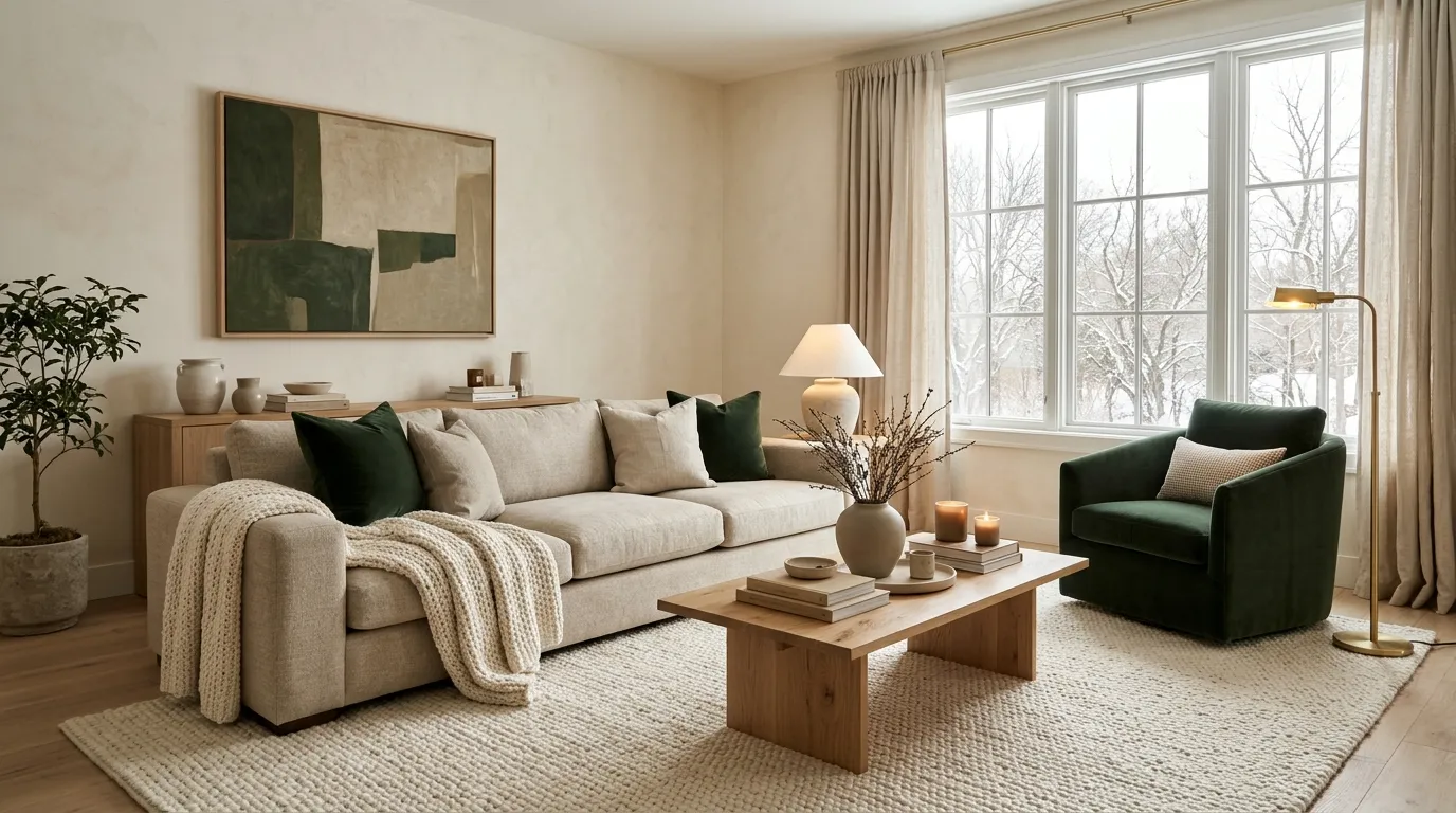
9 Cozy Winter Living Room Color Palettes With Warm Neutrals and Deep Green Accents
Winter changes how a room feels. The days get short, the light turns soft and grey, and suddenly your living room needs to do more than just look nice. It needs to feel like a hug.
The good news? You do not need a big budget or a full makeover to get that feeling. You just need the right colors.
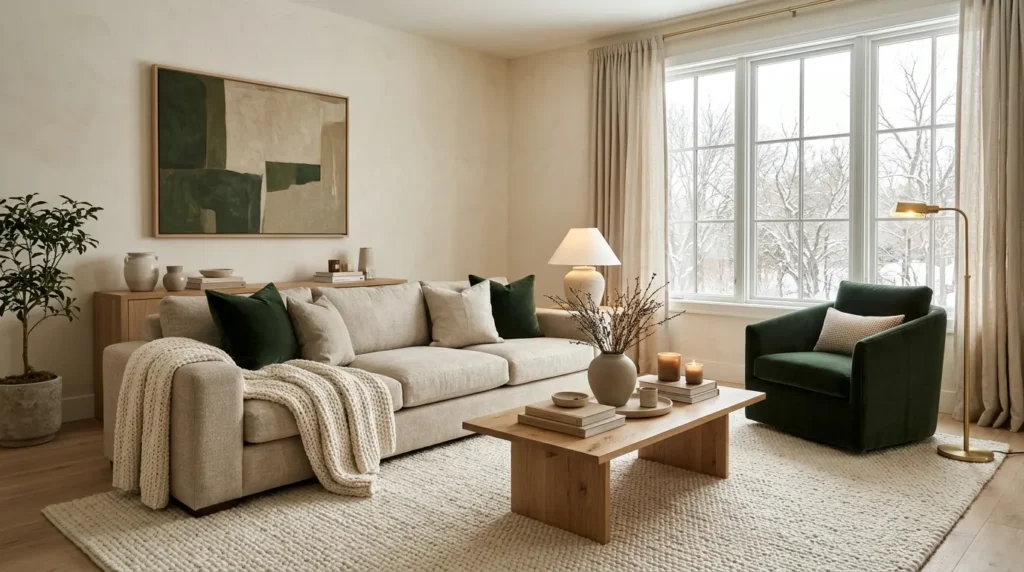
Warm neutrals like cream, oatmeal, sand, and camel make a room feel calm and open. Deep greens like forest, pine, and emerald add depth, like a quiet walk in the woods. Put them together and you get a living room that feels rich, relaxed, and ready for hot cocoa.
Below, you will find nine easy color palettes. Each one comes with hex codes, a short note on the mood, and simple ideas you can try this weekend. Pick one, mix a few, or just steal the parts you like.
Why Warm Neutrals and Deep Green Work So Well in Winter
Before we jump into the palettes, let us talk about why this pairing works so well.
- Warm neutrals feel soft. Colors with a yellow, pink, or brown base feel gentle. They make a room look like it is glowing, even on a cloudy day.
- Deep green feels natural. Green is the color of trees, moss, and leaves. Even in a dark shade, it makes people feel calm and grounded.
- They balance each other. Neutrals give your eyes a place to rest. Green gives the room a clear focal point. Neither one fights for attention.
- They look good in any light. Warm daylight, lamp light, and candle light all make this combo look richer, not flatter.
That is the secret. Light and warm on one side, dark and leafy on the other.
Quick Look: All 9 Palettes at a Glance
| # | Palette Name | Main Mood | Best For |
|---|---|---|---|
| 1 | Oatmeal and Forest | Calm and classic | Small and medium rooms |
| 2 | Cream and Emerald | Rich and cozy | Rooms with velvet or silk |
| 3 | Greige and Hunter Green | Modern and balanced | Open-plan spaces |
| 4 | Camel and Pine | Warm and rustic | Cabin-style homes |
| 5 | Warm White and Moss | Fresh and light | Rooms with little daylight |
| 6 | Sand and Bottle Green | Earthy and relaxed | Boho and natural looks |
| 7 | Chocolate and Evergreen | Deep and moody | Large rooms, evening use |
| 8 | Taupe and Layered Green | Soft and layered | Renters and quick updates |
| 9 | Linen and Spruce | Crisp and calm | Minimal, clean spaces |
Palette 1: Oatmeal and Forest
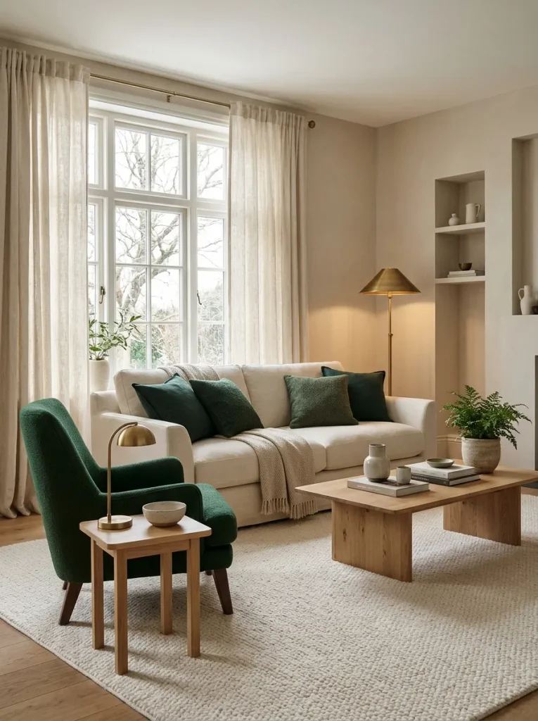
This is the palette to pick if you want something safe, soft, and almost impossible to get wrong. Oatmeal walls make the room feel warm without being yellow, and forest green adds just enough depth to keep things interesting. It works best in small or medium living rooms where you want a calm, quiet feeling. Pair it with light oak wood, wool throws, and brass lamps.
| Color | Hex Code | Where to Use It |
|---|---|---|
| Soft Oatmeal | #E8DCC8 | Walls |
| Warm Cream | #F5EFE0 | Ceiling, trim, curtains |
| Light Oak | #C9A877 | Wood furniture, frames |
| Forest Green | #2F4F3A | Sofa, armchair, accent wall |
| Deep Pine | #1F3326 | Pillows, vase, books |
Easy ways to try it:
- Paint the walls oatmeal and keep the sofa a light neutral
- Add one forest green armchair in the corner
- Use cream curtains that hang from ceiling to floor
Tip: If your room feels flat, add one dark pine object, like a lamp base or a big vase. It gives the eye a place to land.
Palette 2: Cream and Emerald
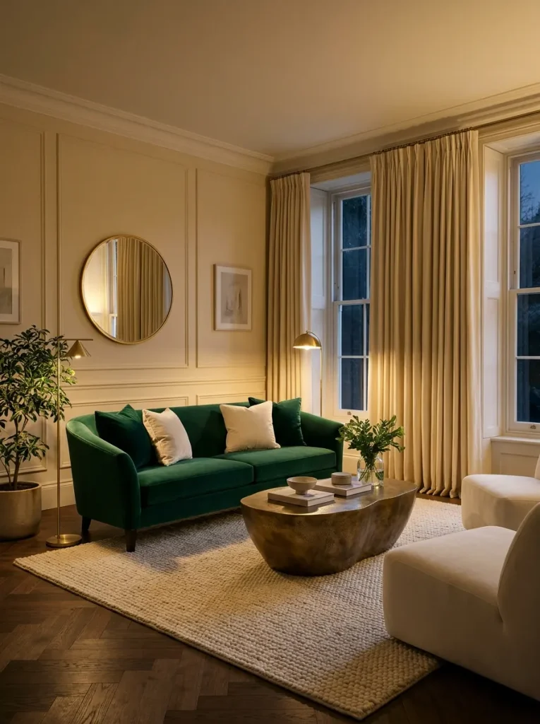
Want a little more glam? Emerald green is bold, but when you place it next to creamy white, it feels rich instead of loud. The mood is cozy luxury, like a quiet hotel lounge on a snowy night. This palette is perfect for velvet sofas, silk pillows, and gold or brass details. Pair it with warm white walls and soft candlelight.
| Color | Hex Code | Where to Use It |
|---|---|---|
| Soft Cream | #F7F1E3 | Walls, large rug |
| Ivory | #FFFBF0 | Curtains, bedding-style throws |
| Antique Gold | #B8924A | Lamps, mirror frames, tray |
| Emerald | #1E5C46 | Velvet sofa, pillows |
| Dark Emerald | #123D2E | Accent wall, bookcase back |
Easy ways to try it:
- Choose a velvet emerald sofa and keep everything around it creamy
- Hang a round gold mirror above the sofa
- Add a cream shaggy rug to soften the look
Good to know: Emerald looks best with warm light bulbs. Choose bulbs around 2700K so the green looks deep and not cold.
Palette 3: Greige and Hunter Green
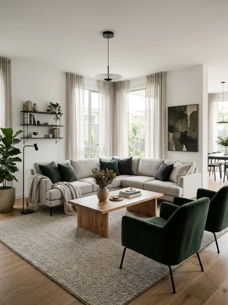
Greige is a mix of grey and beige, and it is one of the best neutrals for modern homes. It feels calm, clean, and a little more grown-up than plain cream. Hunter green is a classic, slightly darker green that fits right in. This palette suits open-plan rooms because it connects easily with kitchens and dining areas. Pair it with black metal accents and natural wood.
| Color | Hex Code | Where to Use It |
|---|---|---|
| Light Greige | #D6CFC4 | Walls |
| Warm Stone | #B9AE9F | Sofa, large rug |
| Soft White | #F3F0EA | Trim, shelves |
| Hunter Green | #355E3B | Armchair, curtains |
| Charcoal Black | #2B2B2B | Frames, lamp, coffee table legs |
Easy ways to try it:
- Use a greige sofa and add hunter green pillows in two sizes
- Choose a black metal coffee table for a sharp contrast
- Put plants with dark leaves near the window
Tip: Greige can turn cold in north-facing rooms. Check the undertone in daylight before you buy a full can of paint.
Palette 4: Camel and Pine
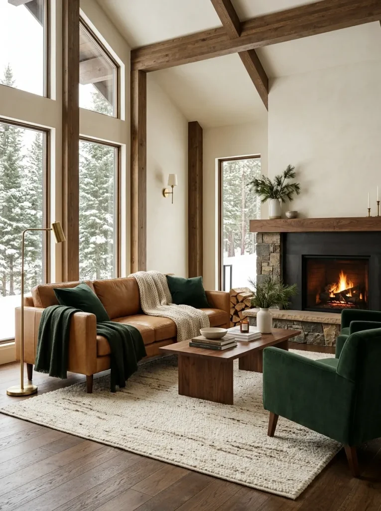
This one feels like a mountain cabin. Camel is a warm golden brown that looks great on leather, wool, and wood. Pine green sits right beside it like a tree beside a trunk. The mood is warm, rustic, and a little bit nostalgic. Use it in rooms with a fireplace, wooden beams, or lots of natural texture. Pair it with chunky knit blankets and woven baskets.
| Color | Hex Code | Where to Use It |
|---|---|---|
| Warm Ivory | #F2E9D8 | Walls |
| Camel | #C19A6B | Leather sofa, throw blankets |
| Walnut | #6B4A2F | Coffee table, shelves |
| Pine Green | #2D4A3E | Curtains, armchair |
| Dark Spruce | #1B2E26 | Pillows, rug border |
Easy ways to try it:
- Pair a camel leather sofa with pine green pillows
- Add a wool plaid blanket with both colors in it
- Use a jute or wool rug with a simple border
Good to know: Leather and green can feel heavy. Keep the walls light so the room still feels open.
Palette 5: Warm White and Moss
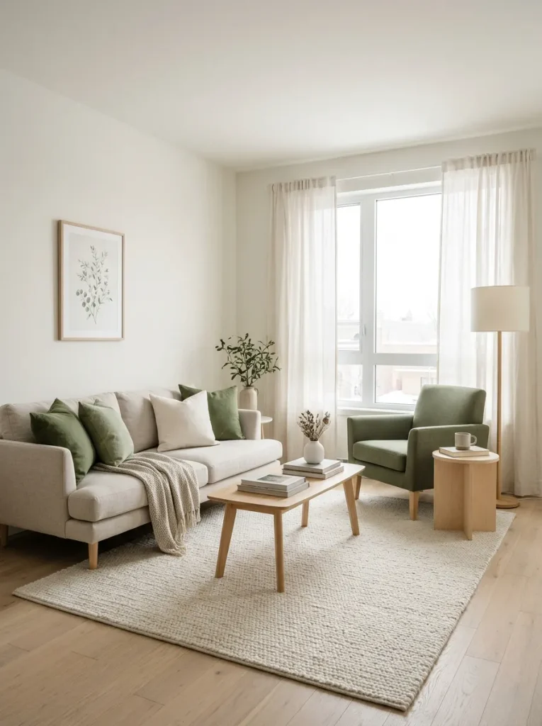
Some living rooms do not get much sunlight in winter. If that sounds like yours, this palette will help. Warm white reflects as much light as possible, while moss green brings in a soft, natural feel without making the room dark. The mood is fresh, gentle, and calm. It is great for apartments and small rooms. Pair it with pale wood, linen, and soft grey-brown accents.
| Color | Hex Code | Where to Use It |
|---|---|---|
| Warm White | #FAF6EE | Walls, ceiling |
| Pale Oat | #EADFCB | Sofa, curtains |
| Birch Wood | #D8BE98 | Side tables, shelves |
| Moss Green | #5A6B3F | Pillows, plant pots, throw |
| Olive Deep Green | #3C4A2B | Armchair, art print |
Easy ways to try it:
- Keep the large pieces light and add moss green in small doses
- Hang one big green art print above the sofa
- Choose a linen curtain that lets light pass through
Tip: In a dim room, use green on objects, not on all four walls. It keeps the space bright.
Palette 6: Sand and Bottle Green
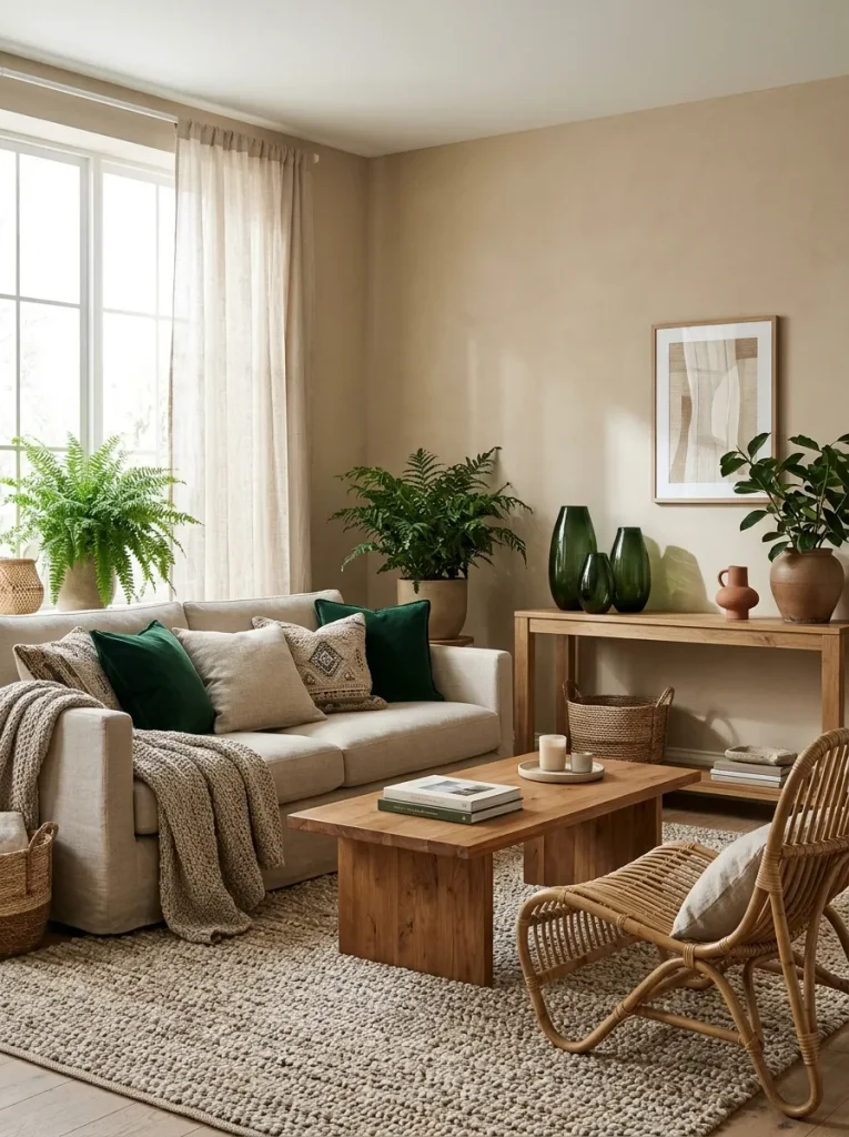
Think of a warm beach in winter, with dark glass bottles lined up in the window. Sand is a soft yellow-beige, and bottle green is a deep, slightly blue green. Together, they feel earthy and relaxed, perfect for boho and natural styles. This palette loves texture, so bring in rattan, cane, woven rugs, and dried grass. Pair it with terracotta pots and warm wood.
| Color | Hex Code | Where to Use It |
|---|---|---|
| Soft Sand | #E5D5B8 | Walls, sofa |
| Biscuit | #D2B48C | Rattan chairs, baskets |
| Terracotta | #B5654A | Small accents, pots |
| Bottle Green | #1F4D3A | Pillows, vase, cabinet |
| Dark Forest | #16332A | Frames, books |
Easy ways to try it:
- Add a cane chair or a rattan side table
- Group three green glass vases on a shelf
- Use a terracotta pot with a big leafy plant
Good to know: Keep terracotta small. A little goes a long way with green.
Palette 7: Chocolate and Evergreen
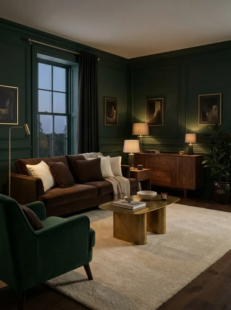
This is the moodiest palette in the list. Chocolate brown and evergreen are both dark and rich, so the room feels deep and snug, almost like a cave in the best way. It works best in large living rooms or rooms you mostly use in the evening. To keep it from feeling too heavy, add cream or light beige in the rug, curtains, or lampshades. Pair it with warm lamp light and soft textures.
| Color | Hex Code | Where to Use It |
|---|---|---|
| Chocolate Brown | #4A3426 | Sofa, wood furniture |
| Mocha | #8B6B54 | Side table, leather pouf |
| Soft Cream | #F1E7D4 | Rug, lampshades, throws |
| Evergreen | #1E3D32 | Walls, curtains, armchair |
| Muted Gold | #A6823F | Lamp base, picture frames |
Easy ways to try it:
- Paint one wall evergreen and leave the other walls light
- Use a cream rug to brighten the floor
- Add soft lamps instead of one bright ceiling light
Tip: Dark rooms need layers of light. Use two or three lamps at different heights.
Palette 8: Taupe and Layered Green
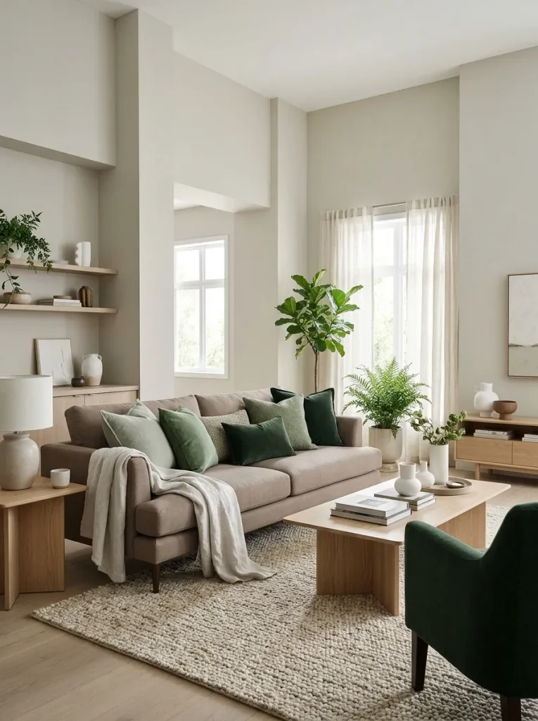
This palette is made for people who like a soft, gentle look. Taupe is a warm grey-brown that sits quietly in the background. Then you add three or four shades of green, from light sage to deep forest. The mood is calm and layered. It is also very friendly to renters, because you can build it with pillows, throws, plants, and art instead of paint. Pair it with simple wood and white ceramics.
| Color | Hex Code | Where to Use It |
|---|---|---|
| Warm Taupe | #B8A99A | Sofa, rug |
| Light Linen | #EFE8DC | Curtains, throws |
| Sage Green | #9CAF88 | Light pillows, small plant pots |
| Fern Green | #4F6F52 | Throw blanket, art print |
| Deep Forest | #263B2D | Armchair, large pillow |
Easy ways to try it:
- Mix three green pillows in different shades on a taupe sofa
- Place plants in cream or white pots
- Layer a green throw over the arm of the sofa
Good to know: Use an odd number of green items, like three or five. It looks more natural.
Palette 9: Linen and Spruce
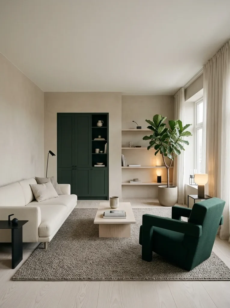
If you love clean lines and calm spaces, this one is for you. Linen is a soft, natural off-white, and spruce is a dark green with a little bit of grey in it. The mood is crisp but still warm, like a quiet morning with a cup of tea. It is great for minimal living rooms where you want fewer things but more feeling. Pair it with pale wood, simple shapes, and a few black details.
| Color | Hex Code | Where to Use It |
|---|---|---|
| Natural Linen | #EDE6D6 | Walls, sofa |
| Pale Ash Wood | #CDB89A | Floor, shelves |
| Warm Grey Brown | #8E8274 | Rug, side table |
| Spruce Green | #2E4A40 | Armchair, curtains, door |
| Soft Black | #232323 | Frames, lamp, small decor |
Easy ways to try it:
- Paint the front door or one built-in shelf spruce green
- Keep surfaces clear and display only a few items
- Use one large plant instead of many small ones
Tip: In a minimal room, texture does the work. Choose linen, wool, and wood so the room does not feel plain.
How to Use These Palettes in Your Living Room
Now you have nine options. The next step is putting one into your home without feeling lost. Here is a simple way to do it.
1. Follow the 60-30-10 Rule
This rule keeps your room balanced. It is easy to remember.
| Share | What It Covers | Example |
|---|---|---|
| 60% | Main color | Walls, large rug, big sofa (warm neutral) |
| 30% | Second color | Curtains, armchair, furniture (wood or deeper neutral) |
| 10% | Accent color | Pillows, vase, art, plants (deep green) |
If you want a bolder look, you can raise the green to 20 or 30 percent. Just keep the rest calm.
2. Start With the Biggest Item
Look at what you already own. If you have a big sofa or rug you cannot change, pick the palette that matches it. Then build around it. This saves money and keeps things simple.
3. Test Colors in Your Own Light
Paint and fabric look different at home than they do in a store. Before you commit:
- Buy a small sample pot or order fabric swatches
- Look at them in the morning, afternoon, and evening
- Check them under lamp light too, since winter nights are long
4. Add Texture, Not Just Color
Texture is what makes a room feel cozy. A room with only flat surfaces can feel cold, even with the right colors. Try these:
- Chunky knit throws
- Velvet or corduroy pillows
- Wool or jute rugs
- Linen curtains
- Wood, rattan, and ceramic pieces
5. Use Warm Lighting
Light changes color. Cool white bulbs can make green look flat and cream look grey. Use warm bulbs, around 2700K. Add a few small lamps, a candle or two, and maybe a string of soft lights near a shelf.
6. Bring in Real Plants
Deep green looks even better when real leaves are nearby. You do not need a jungle. A few easy plants are enough:
- Snake plant
- Pothos
- Rubber plant
- ZZ plant
- A simple bunch of pine or eucalyptus in a vase
7. Keep Metals Warm
Brass, gold, and bronze fit these palettes best. Black also works well in small amounts. Silver and chrome can feel a bit cold next to cozy neutrals, so use them with care.
Where to Place Deep Green in the Room
Not sure where to put the green? Here is a quick guide from small and safe to big and bold.
| Level | Idea | Effort |
|---|---|---|
| Easy | Pillows, throws, plants, vases | Low |
| Medium | Curtains, rug, one armchair, art | Medium |
| Bold | Sofa, built-in shelves, cabinet paint | Higher |
| Very bold | Accent wall or full green walls | Highest |
If you are nervous, start with the easy row. You can always go bigger later.
Common Mistakes to Avoid
Even good palettes can go wrong. Watch out for these.
- Using too many greens that do not match. Stick to shades with the same undertone. A yellow-green and a blue-green can clash.
- Making everything dark. Deep green needs light neutrals next to it. Otherwise, the room feels heavy.
- Forgetting the floor. A bare, cold floor can ruin a cozy room. Add a rug.
- Skipping contrast. If everything is the same shade, the room looks dull. Mix light and dark.
- Buying paint without testing it. Always try a sample first.
Simple Winter Styling Ideas to Finish the Look
Once the colors are in place, small touches make the room feel complete.
- Drape a warm throw over the sofa arm
- Place a tray with candles on the coffee table
- Hang a wreath or a simple branch in a vase
- Stack a few books with green or cream covers
- Add a small basket for extra blankets
- Keep a bowl of pinecones or dried oranges near the window
These little things tell the room it is winter, without any loud holiday decor.
Frequently Asked Questions
Can I use deep green in a small living room?
Yes. Use it in small amounts, like pillows, a throw, or a single chair. Keep the walls and large furniture light so the room still feels open.
What wall color goes best with deep green furniture?
Warm white, cream, oatmeal, and soft greige all work well. They give green room to stand out.
Is green still in style for living rooms?
Yes. Deep and natural greens have been popular for a while, and they feel calm and timeless, so they are not likely to look old fast.
What if my room has no natural light?
Choose Palette 5 (Warm White and Moss) or Palette 8 (Taupe and Layered Green). Keep the walls light, use green on objects, and add warm lamps.
Can I mix two of these palettes?
Sure. Just pick one set of neutrals and one main green, then keep to them. Too many mixed colors will make the room feel messy.
Final Thoughts
A cozy winter living room does not come from fancy furniture. It comes from warm colors, soft textures, and a few deep green touches that make you feel calm the moment you walk in.
Start small. Choose one palette that matches how you want to feel, whether that is calm, rich, rustic, or moody. Test it in your light, add texture, and let the room grow slowly.
Before long, you will have a space where you want to curl up with a blanket, a book, and something warm to drink. And that is exactly what winter is for.
Before You Use These Hex Codes
These palettes are decorating ideas, not paint formulas. Please read the notes below before you buy anything.
- Check the codes yourself. Each hex code is a digital color value chosen to match its color name. Open it in a color picker or your design tool to confirm it looks the way you want.
- Screens and photos change color. Screen brightness, display settings, filters, and camera settings can all shift a color. What you see here may look different on your phone, your laptop, or in print.
- Paint, fabric, and wood vary. Two products with the same name can look different. Always test a sample or swatch in your own room, in morning light, evening light, and lamp light.
- A hex code is not a paint code. Use it to find the closest shade on a brand’s own color tool, such as Sherwin-Williams, Benjamin Moore, or Behr, then order a sample pot before you paint.
- No affiliation. Brand names belong to their owners. They are mentioned only to help you search, and this article is not sponsored or endorsed by them.
- Results vary. How a color looks depends on your light, your room, and the furniture around it.